Web
Case Study: My Website
A website gives online presence, visibility and, more in general, a place where you can share your thoughts. Useless to say, mine had been on the TO-DO list for too long.
Client interview
I had three but very clear ideas about how my website was ought to look like and which functionalities it needed.
First of all, I wanted a minimalistic yet welcoming feel. Few elements, really bright colors, a lot of white space, fine touches here and there. Multiple sketches were drawn and several paths were explored. In the end I found the inspiration in high-end soap labels: squared, with a big title, a lot of small writing.
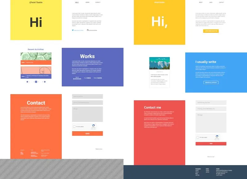
I needed a space where I could briefly talk about myself, post projects and interesting findings as well. A blog section and an about page were consequently added to the requirements.
Last but not least, people had to be able to contact me rapidly, in very few steps. That’s why both my homepage and the navigation bar feature a contact section. Every click drives your customers further away they say. Well, I can confirm that.
Tools and workflow
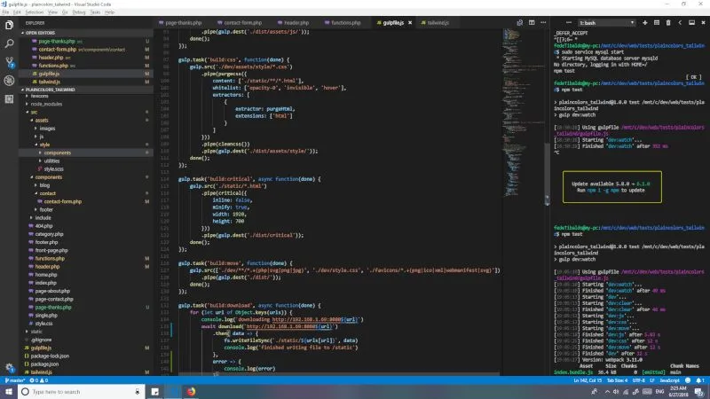
Because the website had to serve blogging purposes as well, I deemed a CMS as necessary, and I opted for the one I’m most proficient with: WordPress.
Even if I don’t usually utilize CSS frameworks, this time I gave a try to TailwindCSS. It was kind of like an experiment, but in the end, it turned out to be quite a good choice, enabling me to focus on styling rather than on managing the codebase.
To purge and minify the stylesheet, as well as to bundle and transpile the scripts and to generate the critical CSS (the styles for the content above the fold) I used Gulp.js in a similar way to how nystudio107 implements its front-end development automation.
Gallery
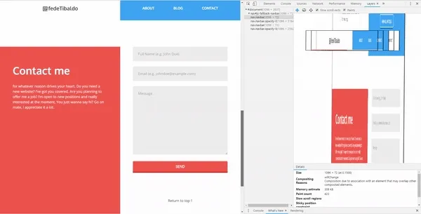
Not-so-transparent navbar
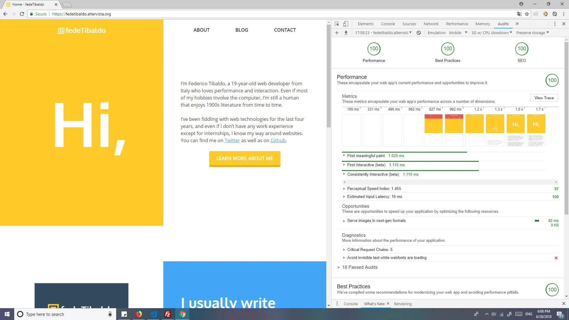
Highly performant